
In 2014 I’ve been blogging about “Interactive Company Reports” for the first time. The initial post is just available in German, but the links and ideas will quickly be reiterated in this post.
Moritz Pawelke (after working at Deloitte as Director | Digital & Analytics @ Financial Advisory he is now working as Head of Consulting at M2 – a Tableau Partner) had this idea of making company reports more interesting by providing people an interactive version of it online. This massively extends the reach of a publication and you can way better review what people find interesting! In order to provide people the ability to jump from a first static impression to an interactive one (being able to filter to the user’s needs) you can easily provide people with QR-codes directly within your report. My visual example of it back in the days was the picture on the right which got adopted quite soon.
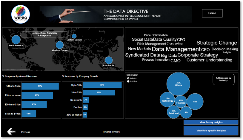
An IT-Service company based out of India called Wipro created an appealing interactive report as part of a survey in 2013:
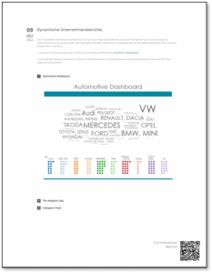
A little bit later Moritz Pawelke and myself got introduced to each other. We put our heads together for KPMG’s first interactive version of their biggest annual survey which just got published as PDF and printed versions back then. The work resulted in an interactive version of KPMG’s Global Automotive Executive Survey. This has been a great success and it leveraged Tableau Data Stories just great! If you’re searching for impressions for nice color codings I can highly recommend you to look at 2016th Tableau Data Story:


This year Dieter Becker Global & EMA Head Automotive Practice and Aline Dodd Global Executive for Automotive slightly changed the approach on how they’ve published the report. So rather than staying with an interactive Data Story they’ve leveraged similar web techniques I’ve been using for my initial demo post. Now you can navigate between different dashboards on their web app depending on your interests. Nice animations makes this visually very appealing. In order to get this year’s report out there we thank Florian Ramseger, Katie Mertens, Olga Kolcheva and Konstantin Greger for their great work!
So feel free to get inspired by the interactively version here.
Leave a Reply