Tableau Data Story – KPMG GAES 2016
Kommentare : 3
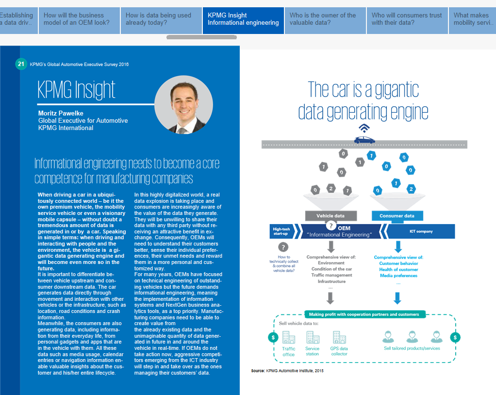
One year ago I was blogging about interactive company reports. Back in the days KPMG was publishing it’s Global Automotive Executive Survey 2015. Today I want to share the next level of it with you!
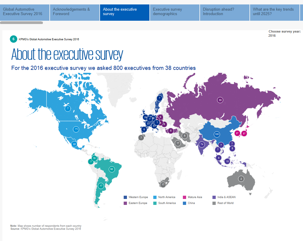
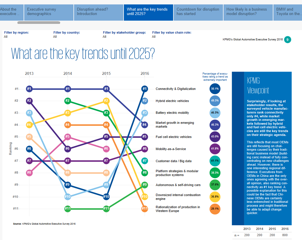
Moritz Pawelke (Global Executive for Automotive at KPMG) himself did another amazing job by publishing this years survey! I highly recommend to have a look at it. Any comments, questions and feelings are highly welcome! Enjoy!
Click here to get to the live version…
What a fantastic use of Tableau story points! I’ve done something similar, and I have a question for you. On the story points that only contain KPMG corporate logos and verbiage, and no Tableau dashboards or graphs, how did they do this? Did they simply insert an image into the story point? Did they create a dashboard with text containers, and if so, how did they get the corporate imagery into the background? Thank you very much!
Hey Mike,
glad you like it and yes you’re completely right – KPMG corporate story points are simply images.
I’d be highly interested in your data story! Please feel free to reach out to me like directly (contact can be found via LinkedIn/Contact formular. You may also want to share it via Tableaufans.com In both ways, looking forward to hear from you!
Cheers,
Timo
Pingback: tableaufans.com » Interactive Company Reports