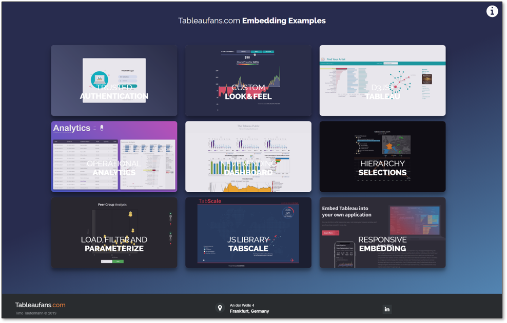
There are different ways on how to embed Tableau in a responsive way. This post references a page where you can see a couple of different examples on how to embed Tableau responsively. All of the examples might have pros and cons which you can discuss and compare with your Tableau contacts as well as your internal and external stakeholders. Some of them can also be mixed and matched like always showing a static preview image which you can get via Tableau’s REST API prior to have the interactive version ready for interaction.
Keep in mind that an average user rarely changes their browser window size! Therefore make sure that you’re not over developing things in your own application. Even if it demos really nicely if a dashboard adjusts while making changes to the browser window – to me the most important thing is that a dashboard fits nicely into the screen where I’m opening it up.
One last personal hint from my side. You’ll see that I’m just focusing on phone and desktop layouts. Why? I highly advise my customers to reduce the amount of content on dashboards. Therefore if a dashboard doesn’t automatically fit into an iPad by default, it probably has too much content on it and it needs to be simplified/split into a master-detail-dashboard or similar approaches.
Without further ado please access, watch, download and customize the examples to make them fit your own needs. Please feel free to leave questions, comments and feelings below the post in order to let me optimize the content over time if this helps others to jump start their own responsive embedding project.
Are you interested in more Embedded Examples? Find more by clicking on the image below:


Leave a Reply