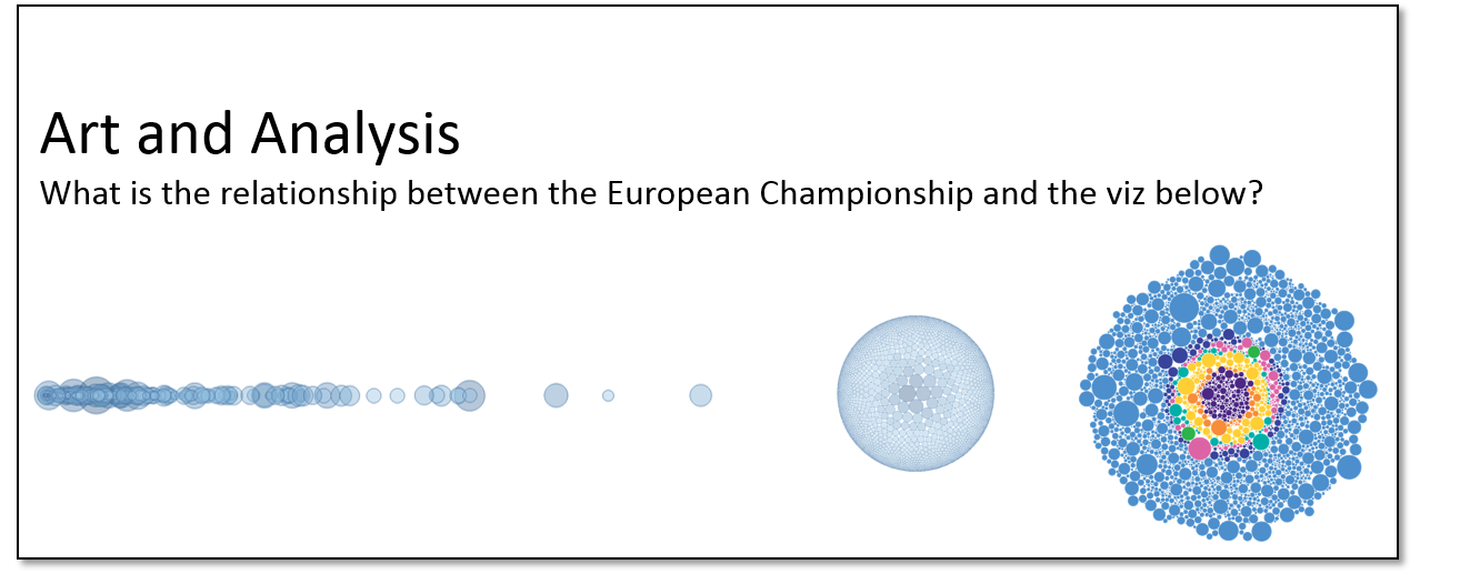
You think the above picture does not make sense at all? Well, that’s not true! You just need to change color and sorting and you’ll figure out what’s within the bubble chart. To help you just a tiny little bit – here we go with the colors you’ll need to discover the unkown:

If you can’t figure it out without the data set you’re more than happy to join 1 out of 2 sessions about “Artilizing Data” at Tableau’s conference on Tour in Munich:
- Wednesday February, 6th 2016 (11:45 to 12:45): Balancing Art and Analysis in Tableau (DE)
- Thursday February, 7th 2016 (11:30 to 12:30): Balancing Art and Analysis in Tableau (EN)


Leave a Reply