Category: Tipps & Tricks

  • Custom Tableau Demo in 15 Minutes

    Custom Tableau Demo in 15 Minutes

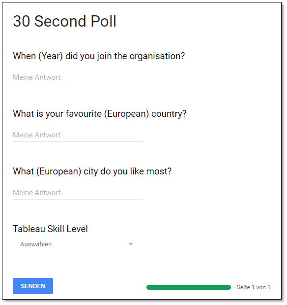
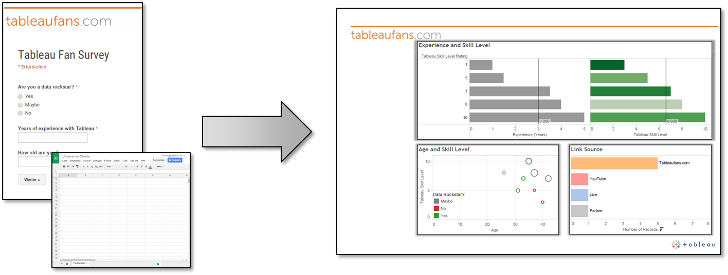
    Today I want to reference a post I made in March 2015. Back in the days I was recording a video about different ways to start a Tableau presentation. A couple of days ago I got invited to give a TechTalk speach at a bank in Frankfurt, Germany. In order to introduce the crowd to Tableau I wanted to do a custom demo. Therefore I was creating a simple Google Form which stores results in a Google Spreadsheet which Tableau can connect natively to since version 10.

    Questions
    The coolest way to demonstrate the power of Tableau should contain a time information (an exact date would be best!), something geographical and some interesting categories. In order to keep it as simple and fast as possible for the audience to answer my questions I was keeping it as easy as possible:

    Answers
    Answers get stored in a Google Spreadsheet. I was adding a couple of things to the default sheet like:      

    • Date: I was not allowed to ask the exact date when people did join the company. In order to demonstrate Tableau’s powerful TIME capabilities I was randomly adding days and months to the actual year when people joined the company
    • Dummy Data: If for whatever reasons people wouldn’t have been able to answer the questions – this would have been my backup data I produced upfront
    • Company: This column alows me to compare companies (anonymously) during future demos


    Outcome
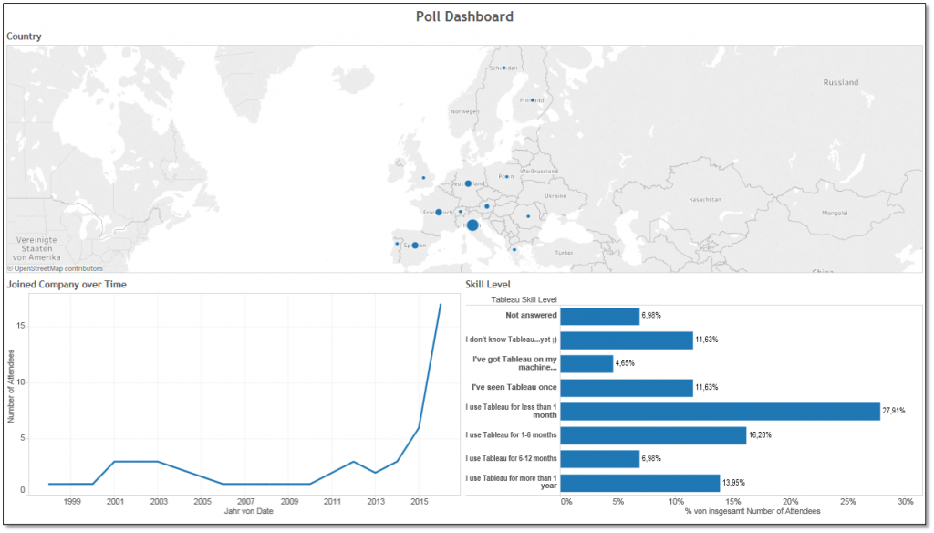
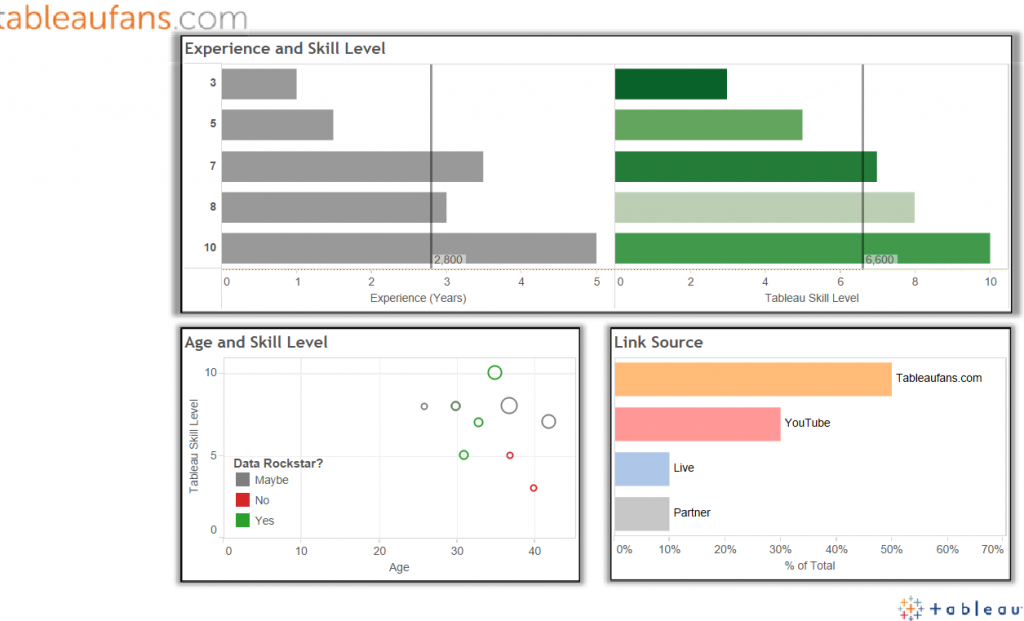
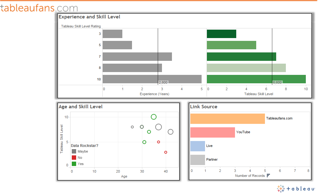
    The best part starts once you take the data and turn it into something meaningful. You can either connect Tableau live to your Google Spreadsheet or simply copy and paste the data into Tableau (which oftentimes creates an even bigger WOW-EFFECT). Whatever you’re coming up with keep in mind that every single drag and drop is already demonstrating the power of Tableau! And while you’re asking questions while you’re already answering them you’ll learn a lot about your audience if you add something like “Tableau Skill Level / How long are you already using Tableau” to one of your questions! This will tell you if you can jump into more sophisticated topics within Tableau or not after you’re “TechTalk / Tableau Day KICKOFF Demo” 😉


    Last but not least please feel free to download the PowerPoint template with AWESOME TABLEAU COLLEAGUES jumping in the background and customize it to your needs (tons of URL + QR code creators are out there! 😉


    Tableaufans.com – PowerPoint Template – Jumping Tableau Colleagues


  • Tableau 10.0 – Custom Territories im Detail

    Klopf, klopf… Wer ist da? TABLEAU 10.0 steht vor der Tür und es bringt viele neue Sachen!

    Geografische Darstellung bis 9.3

    Dies ist in Summe mein zweiter(!) Blog meines Lebens und dieser Umstand macht das Thema sogar noch interessanter als es eh schon ist. Tableau 10 bringt eine Funktion mit, die es erlaubt, ein noch tieferes Verständnis von geografischen Daten zu bekommen. Jeder kennt bereits die Möglichkeit der Zuordnung geografischer Rollen innerhalb von Tableau. Diese Funktion war bis dato schon gigantisch, da es einfach Länder, Bundesländer, Kreise, Städte und unterste Postleitzahlengebiete nicht nur als Punkte, sondern auch als Polygone automatisch, dank der eingebauten Geo-Datenbank, auf einer Landkarte anzeigen konnte.

    BOOM… Geografische Darstellung ab Tableau 10.0

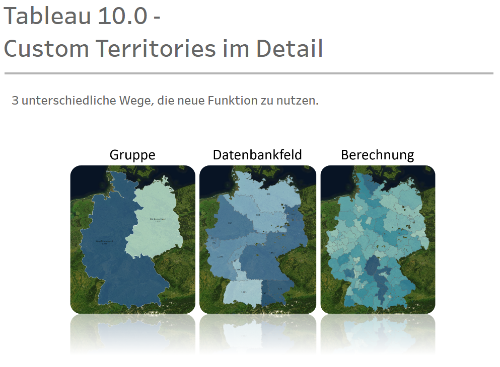
    Tableau 10.0 bietet die Möglichkeit, eigene Gebiete (custom territories) auf einer Karte zu visualisieren. Wenn man den Blogs von Tableau oder anderen Bloggern bzgl. der Version 10.0 gefolgt ist, dann ist das Feature bereits bekannt. Über die Karte lassen sich eigene geografische Gruppen herstellen. Was ist aber, wenn bereits eine geografische Gruppierungsinformation, wie Vertriebs- oder Einzugsgebiete, bereits in der Datenbank existieren oder die Gruppierung auf Basis einer Berechnung innerhalb von Tableau stattfinden soll? Auch daran haben die tüchtigen und kleveren Entwickler von Tableau gedacht.
    Auf Tableau Public liegt ein Workbook mit eingebetteten Video, das alle 3 Varianten abdeckt.


    CT_cover

  • Dynamic Traffic Lights

    Dynamic Traffic Lights

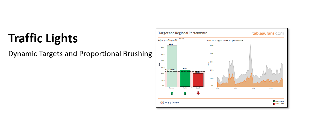
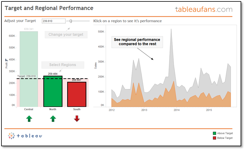
    Today I want to share an idea about how to visualize targets. There are a bunch of different ways to do so. If the data is already part of your CRM solution or data warehouse – just take this information and represent it as bar, bullet graph, traffic light…you name it. If this is not the case you could go with a parameter which every salesperson in your company can use to actually change the target to the individual one. Now you might think…well, but I need to change this target each and every time one is opening the report. This is not the case! If you’ve got Tableau server in place you can easily save a “custom view” and making this your personal “default view” (for this report). This means each and every time “user A” is opening the report/dashboard, user A will see the target he has set last time. The same applies for everyone else.

    Next to the concept of parameters and how you can leverage them I’ve used a concept which is known as “proportional brushing”. This allows you to compare the performance of a region, salesperson, product, etc. against the overall performance. The example dashboard which you can open by clicking on the picture below is showing this over time. So how can you adopt this? Well just download the workbook and try to re-engineer it. You basically need to:


    1. Right click on your date –> Create –> Custom Date –> “Order Date (Month / Year)”
      • This creates a field which just contains month/year
    2. Create a calculated field –> “{ FIXED [Order Date (Month / Year)]: SUM([Sales])}”
      • Represents a Level Of Detail Expression (LOD) which fixes sales to this time dimension
    3. Create a dual axis chart which is containing sales and your calculated LOD
    4. Put this sheet as well as another sheet which works as a filter on a dashboard to see the individual performance compared to the overall performance
  • Turn NULL values into something meaningful

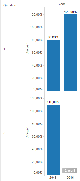
    You may have had this problem in the past: people fill out your survey and skip certain questions. Therefore you’ll see NULL values in your Tableau visualization:

    Turn NULL values into something meaningful - Tableau NULL Values

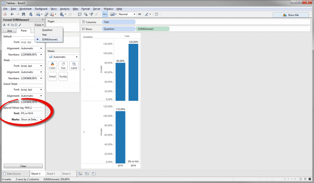
    Technically it is correct to show it in this way, but for your end users you may want to show something like “0 %” or “not answered” instead. How do you do this within Tableau? Well just open up the formatting pane -> Fields -> YOUR_MEASURE and fill out the text box to define what Tableau should visualize if there is no value in a particular cell of your data source:

    Turn NULL values into something meaningful - Special Values instead of NULL

  • Performance boost for your entry dashboards by starting with aggregated extracts

    Performance boost for your entry dashboards by starting with aggregated extracts

    Attached you’ll find a video which is focusing on a specific performance requirement for their management. Maybe it helps you to gain ideas of how you can mix and match live and extract connections to provide your users with fast and interactive dashboards where they need it.

  • Best Practices for Designing Efficient Tableau Workbooks

    Best Practices for Designing Efficient Tableau Workbooks

    This is the Link to our third best practices document about how to design efficient Tableau workbooks from MR High Efficient itself – Alan Eldridge:

    Best Practices for Designing Efficient Tableau Workbooks

  • Starting a Tableau Presentation

    This video demonstrates 3 different ways of how you can actually start a presentation about a Tableau related topic:

    Click on this link for the sample dashboard on Tableau Public.

  • Google Sheets & Google Forms

    Google Sheets & Google Forms

    Deutsch

    Anbei ein Video, dass demonstriert wie ich mich mit Tableau und einem ODBC Treiber live zu einem Google Spreadsheet verbinden kann.


    Das Ergebnis aus dem Video mit dem Link zu Tableau Public:

    Google Sheets & Google Forms iPad

    English

    This video demonstrates how you are able to connect Tableau with a Google Spreadsheet using a 3rd party driver.


    The result from the video including the link to Tableau Public:

    Google Sheets & Google Forms iPad


  • Dynamische Unternehmensberichte

    Dynamische Unternehmensberichte

    Wenn Unternehmen Informationen veröffentlichen ist man in aller Regel daran interessiert, dass diese Informationen auch von einem möglichst breiten Personenkreis konsumiert werden. Eine Möglichkeit dazu bietet Tableau Public im Zusammenspiel mit dem eigenen Webauftritt. Anbei 2 einfache Beispiele dies zu realisieren:

    1. Wipro, ein IT-Dienstleister aus Indien, mit dem auf Ihrer Website veröffentlichten interaktiven Tableau Bericht

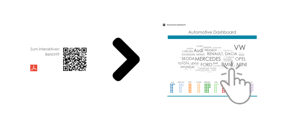
    2. Die Möglichkeit Berichte in Sektionen zu unterteilen, die beispielsweise via QR-Codes gezielt aus einem physischen Bericht oder einer PDF Datei aufgerufen werden können:

    Statischer Unternehmensbericht


    [accordion]
    [acc_item id=”item-1″ title=”Automotive Dashboard”]


    [/acc_item] [acc_item id=”item2” title=”The Adoption Gap”]

    [/acc_item]
    [acc_item id=”item-3″ title=”Instagram Food”]

    [/acc_item]
    [/accordion]

  • Kennzahlen mittels TreeSelector auswählen

    Kennzahlen mittels TreeSelector auswählen

    [accordion]
    [acc_item title=”Vorgeschichte”]Bei einem Kundentermin kam neulich das Thema KPI’s (Key Performance Indicator) auf.  Jedes Unternehmen hat bei diesem Thema eine andere Sichtweise und es gibt unterschiedliche Art und Weisen damit umzugehen. Manche Beratungshäuser empfehlen nur eine begrenzte Anzahl an Kennzahlen für Analyse und Reporting einzusetzen und manche Branchen führen hunderte von Kennzahlen durch alle Hierarchien eines Unternehmens. Letzteres war bei besagtem Kunden der Fall. Die Frage war wie geht man mit einer solchen Masse an Kennzahlen um?[/acc_item]
    [acc_item title=”Problem”]

    Aus Tool-Sicht ist diese Frage relativ einfach zu beantworten: „Tableau erkennt automatische ob eine Information (Spalte) eine Dimension oder eine Kennzahl ist. Will man die Kennzahl ändern zieht der Enduser lediglich eine andere Kennzahl in seine Visualisierung.“

    Was jedoch tun, wenn man eine Visualisierung auf der eigenen Website darstellen, dem normalen User nicht die Möglichkeit des “Webeditierens” geben und dennoch den übersichtlichen Zugriff auf 200 Kennzahlen gewährleisten möchte?! Oder einfacher: Wie kann ich mehr als 50 Kennzahlen sinnvoll auf einem Dashboard zur Auswahl bereitstellen? Geht nicht? Probieren wir es aus:

    [/acc_item]
    [acc_item title=”Lösung”]

    Das Einbetten von Tableau-Visualisierungen in eigene Websiten oder Applikationen ist extrem einfach und lässt sich individuell anpassen: http://www.tableausoftware.com/public/blog/2014/03/fix-your-iframe-2386

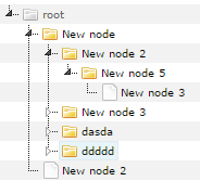
    Eine größere Herausforderung stellt da die übersichtliche Darstellung von extrem vielen Kennzahlen dar. Meine Erfahrung zeigt, dass sich Kennzahlen oftmals gruppieren lassen. Das legt die Möglichkeit einer Orderstruktur nahe. Wenn es möglich ist Thematisch ähnliche Kennzahlen zusammen zu fassen, kann man diese bestimmt auch weiter verschachteln. Es kam also die Idee auf Kennzahlen über einen TreeSelector auszuwählen. Also suchte ich nach einer Javascript Library für TreeSelector und wurde hier fündig: jstree

    TreeSelector


    1. Visualisierung Mittels Javascript aufrufen

    So begann ich mit Notepad++ meine eingerosteten HTML und Javascript Kenntnisse aufzufrischen indem ich  Code aus einem Tutorial in eine leere HTML Seite kopierte. Nach ein paar Anläufen gelang es mir auf Knopfdruck einzelne Visualisierungen ein und auszublenden. Auch Kennzahlen in Form von Parametern konnte ich nach einigen Minuten mittels der Funktion “changeParam” aus der Javascript Library von Tableau beliebig anpassen.

    2. TreeSelector Library einbinden

    Auf der oben genannten Website lässt sich die gesamte Library runterladen. Mit einem einfachen Verweis ist die Library innerhalb der eigenen HTML-Seite dann verwendbar: <script src=”script/jstree/dist/jstree.min.js”></script> Die Struktur in Form einer Ordner Hierarchie lässt sich anschließend mittels des Tags “<ul>” erstellen.

    3. TreeSelector mit Visualisierung verbinden

    Jedes Element innerhalb des TreeSelectors kann mit einer Javascript “onclick” Funktion versehen werden die ihrerseits wieder genau die gewünschte Kennzahl als Parameter an die Funktion “changeParam” weiter geben kann. Damit verändert man den Parameter der Visualisierung um genau die Kennzahl, die der User entsprechend mittels Mausklick ausgewählt hat.


    HTML, CSS und Javascript Dateien hier zum Download

    [/acc_item]
    [/accordion]